Unified giving architecture
A shared destination connected many fundraising opportunities.
Case study / Higher education philanthropy
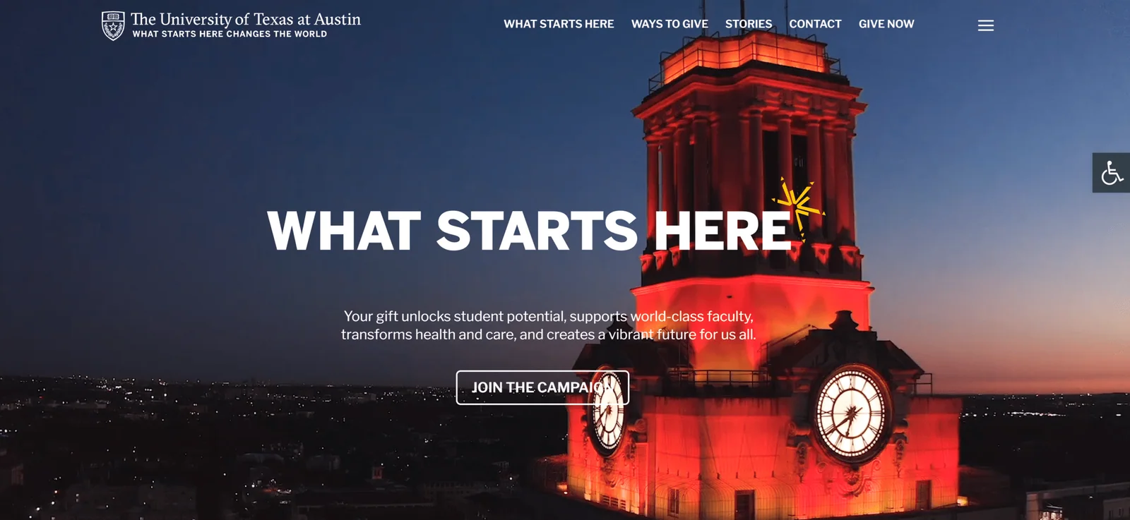
A unified WordPress presence brought campaign content, school initiatives, stories, and donation paths together.
Pixeldust Interactive contribution: Project delivery leadership
01 / The problem
The university's Giving and Capital Campaign sites were separate, making it harder for donors to move between programs. The institution needed one coherent experience spanning schools, fundraising priorities, and stories of impact.
02 / The solution
Working from university-provided design, the team built a flexible WordPress site with custom jQuery storytelling, video, RSS feeds, archives, and donation links throughout the experience.
A shared destination connected many fundraising opportunities.
A jQuery-driven feature highlighted students, alumni, faculty, and university work.
Visitors could reach giving opportunities from multiple areas of the site.
03 / Business value
The work addressed a real challenge for University of Texas Giving—improving the experience for customers, teams, or both.
Prospects could find relevant opportunities without jumping between disconnected sites.
Multimedia helped explain the human impact of donations.
WordPress and RSS feeds supported updates from across the university.
04 / Technology
Technologies and deliverables from the historical project are shown as originally documented, including earlier-generation platforms where applicable.
The takeaway
A giving website should bring a complex institution together around clear reasons to contribute.
Explore all case studiesMake your website work harder
Tell us what needs to work better. We'll help map a practical path forward.