One big challenge when building a component library is prioritizing accessibility.
Accessibility is usually seen as one of those “nice-to-have” features, and unfortunately, we’re still far from considering it an essential part of a developer’s skill set. I get it — introducing accessibility practices can be challenging and time-consuming. But there are amazing tools that can help you and your team make that implementation less overwhelming and, more importantly, make it last.
In this article, we’ll be exploring Storybook’s accessibility addon in the following sections:
- How to install and configure the addon
- Using the accessibility addon to test a Navigation component
- Walk through some common accessibility issues that can be easily audited with the help of Storybook
Why Storybook?
Storybook is broadly used across teams to develop a consistent UI. This open source project brings design and engineering teams together to focus on organizing a perfect component library.
With the help of multiple contributors, Storybook’s team has been developing new addons that extend additional features to their core UI. In their effort to help users build accessible applications, Storybook released their accessibility addon.
The idea behind this project is to provide support for automated accessibility tests within Storybook to capture and surface accessibility errors. Solving these issues throughout the development process allows us to spend more time on manual testing with assistive technologies and, consequently, to raise accessibility standards throughout the web.
The accessibility addon runs the deque axe accessibility testing tool on each Story. axe is an automated accessibility testing tool that can be used with your framework or browser of choice.
The accessibility addon provides a panel in which we can visualize axe’s test results within each Story’s UI. This is pretty great because we can test our component’s adherence to common accessibility standards and guidelines within the developing process.
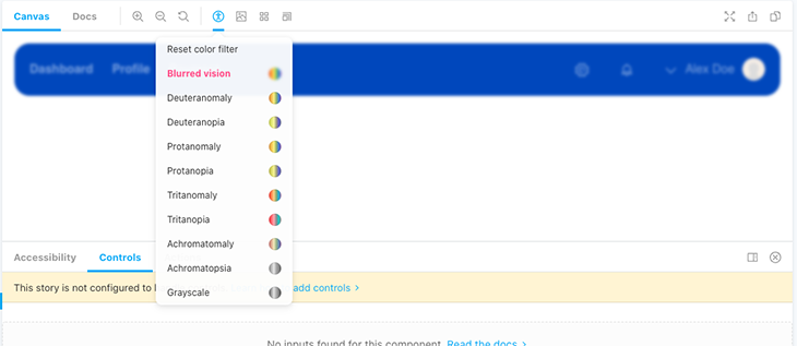
On top of that, the accessibility addon includes a color blindness simulator that replicates visual impairments such as deuteranomaly, protanomaly, or tritanopia.
Adding the accessibility addon to your project
Before installing Storybook, it is important to keep in mind that it cannot be run in an empty project. Storybook needs to check your project’s dependencies to provide you with the best configuration. In our case, we’ll run it in a React application.
For this reason, we’ll run Create React App first to initialize our React application. If you have a desired project in mind, you can simply install Storybook:
# Add Storybook:
npx sb init


# Starts Storybook in development mode
npm run storybook
Storybook already comes with some essential addons, but unfortunately, these do not include the accessibility addon, so we’ll have to install it as well:
npm install @storybook/addon-a11y
To conclude with the set up, we’ll need to create or add a main.js file inside the .storybook folder with the following:
// .storybook/main.js
module.exports = {
  addons: ['@storybook/addon-a11y'],
};
Testing our component
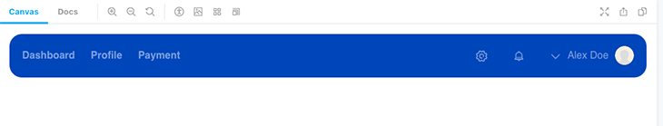
Let’s have a look at an example of a top navigation component.
At first glance, the component looks ready to ship, but if we go into the accessibility tab, the tests tell us something different.
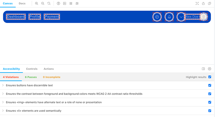
The navigation component is missing certain accessibility requirements, so axe enumerates four violations.
The accessibility addon comes with a Highlight results checkbox that helps identify the components that are failing. This can be very useful when dealing with bigger components because it will save us from having to rerun these tests individually in each component.
- Ensure buttons have discernible text — indicates that when using icons as buttons without a visible label, it is important to add an inner text for screen readers, which can be done by adding an
aria-label- Our contrast ratio doesn’t meet the WCAG AA ratio thresholds, which makes our links and text hard to read across the component
- Our Navbar includes an avatar with an image that does not have an
altattribute for alternate text descriptions
- Ensure
<li>elements are used semantically — detects that the list elements that are being used as links are not wrapped in a<ul>element. Using semantic HTML is highly recommended because it allows screen readers and assistive technology users to easily navigate across the page’s heading and sections
As I mentioned earlier, the accessibility addon detects all of these accessibility violations fairly quickly, which makes it great for maintaining a high focus on core accessibility standards at an early stage of the development process.
Configure axe to your needs
It is worth mentioning that the accessibility addon respects axe’s rule-based system and allows us to configure the accessibility violations depending on our needs.
For a better understanding of the set of rules that you can override and disable, check the axe-core configurationOptions. If you’re not too familiar with axe, I highly recommend going through the rule description — it will give you insight into what rules can be customized and provide you with further research on the best scenarios in which to do so.
For example, we can override some of these rules on the Story-level using parameters.a11y.config.rules:
const Story = {
 title: "Components/Navigation",
 component: Nav,
 parameters: {
   a11y: {
     config: {
       rules: [
         {
    //  Override the result of a rule to return "Needs Review" rather
    //  than "Violation" if the rule fails. It will show in the
    //  'Incomplete' tab.
           id: "color-contrast",
           reviewOnFail: true,
          },
        ],
      },
    },
  },
};
If we want to ignore a rule at a global level, we can use parameters.a11y.config.rules in our Storybook’s preview.js file:
// .storybook/preview.js
export const parameters = {
  a11y: {
    config: {
      rules: [
        {
          id: 'listItem',
          enable: false,
        },
      ],
    },
  },
};
It is always advisable to include a comment with the reason why a rule was overridden, as it will help you and your team understand why some rules aren’t being reported during testing.
Automating accessibility tests
It is possible to use Storybook in automated tests, and it supports integrating your stories with testing frameworks like Jest. Furthermore, you can also use React Testing Library, too. Or, you can use both.
On top of this, we can also implement accessibility tests on each of our components with the Jest Axe integration. This project introduces an axe-matcher into Jest so that you can automate the search for violations.
const { axe, toHaveNoViolations } = require('jest-axe');

expect.extend(toHaveNoViolations);

/// tests
Conclusion
A final note: other accessibility practices, like testing UI against the most common assistive technologies and including disabilities within your user research, are still highly encouraged methods of testing the accessibility of your apps. This is just one way to surface accessibility issues within your app, and by no means a replacement for the manual tests we described.
It is very exciting to see how there is an increasing effort to introduce developer tools that contribute to building accessible UI. Even though adding test coverage does not ensure your component library is fully accessible, it is certainly a step toward acknowledging accessibility as a standard for a perfect component library.
The post Testing accessibility with Storybook appeared first on LogRocket Blog.