The Tour Module – Create your own Tour for a Custom Theme in Drupal 9 Vinit Kumar 28 Sep, 2021
What can be better than a guided tour when you are at an unfamiliar place?
User experience is slowly turning into the focal point of every business. Offering an experience that helps point your user to the right direction through user interface interactions can be a game-changer for any business. In this article we are going to explore the Tour module for Drupal 9. With the Tour module, you can not only take a guided pre-built tour of an existing view, you can also integrate the Tour module in your custom theme (which we will be explaining in detail later).
The Drupal 9 Tour Module
You would want to implement the Drupal 9 Tour module when you want your user to focus more on certain components on your site that go unnoticed easily. It is also great when you want to take your user through a guided workflow. The Tour module is included in Drupal core since Drupal 8.
When you enable the module it offers guided tours of the website interface with the help of tooltips. To take a Tour, you can edit an existing View at
/admin/structure/views
and click the “? Tour”-link in the upper right-hand corner in the admin toolbar. You can also visit
/admin/structure/views/view/frontpage?tour=1
to auto-start the Views tour.
In Drupal 8, the Tour module is built on the Joyride jQuery plugin, which is deprecated in Drupal 9.2 with Shepherd.js.
We have another method to add a tour for modules and admin interface through YML file. Here, I am adding a tour in a custom theme.
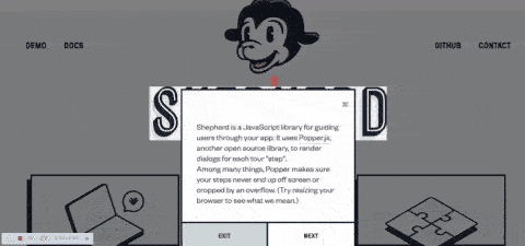
What is Shepherd.js?
Shepherd is a JavaScript library that allows you to easily create guided tours of your app or website. It leverages Popper.js, another open source library, to render dialogs for each tour “step”.
Integrating Tour module in a Custom Theme
In Drupal 9, we have multiple types of content pages to integrate:
- Page Tour
- Node Tour
- View tour etc.
Let’s take an assumption of having a dashboard page which has multiple cards to show with all graphs and values in it like in the image shown below. Here, the tour will make it easy to guide users through the cards and show some details.
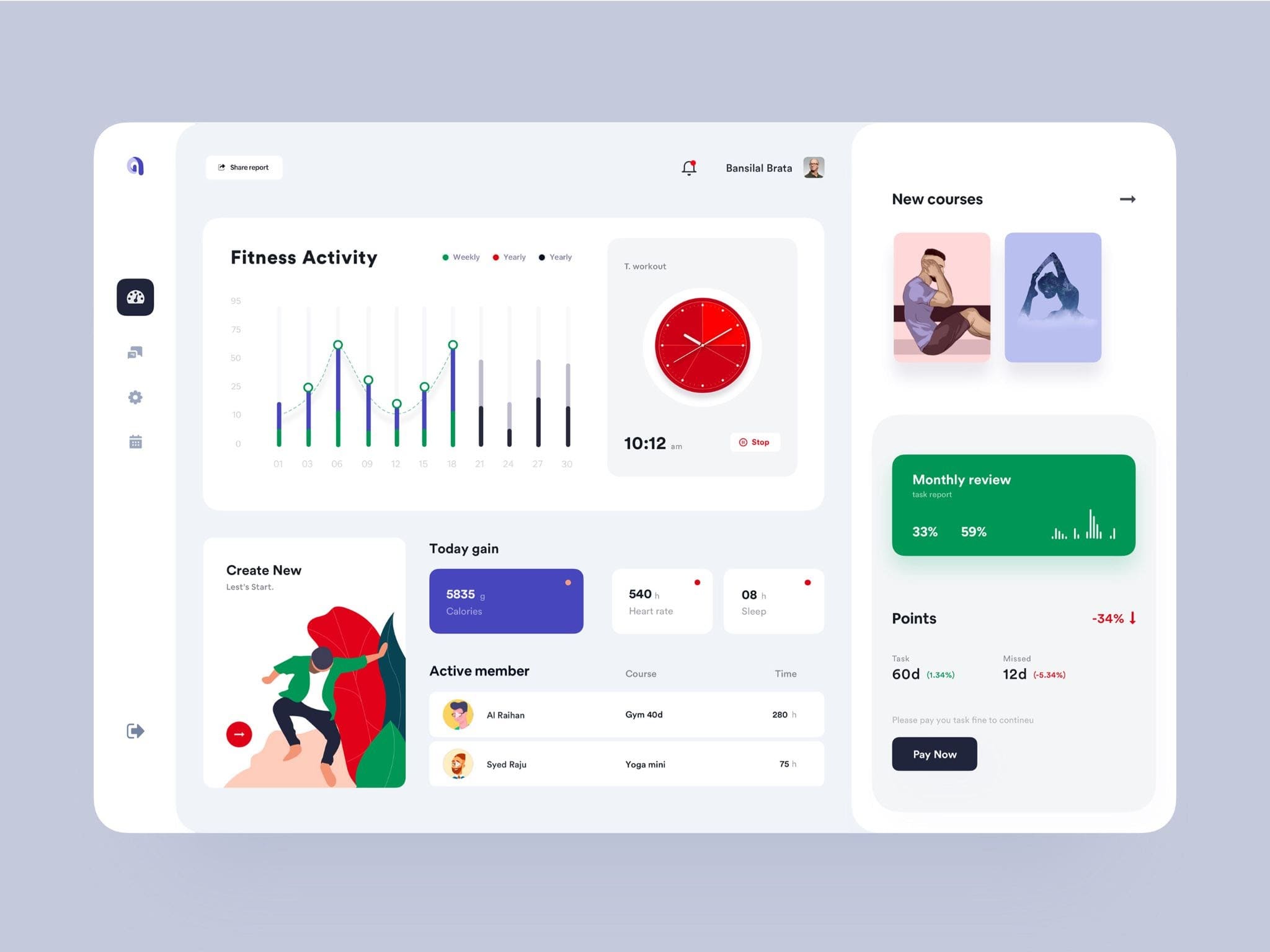
Image credits : Dashboard design
Creating a Dashboard Tour Library
Tour requirements:
A guided tour required for below items/cards
- Fitness Activity
- New Courses
- Create New
- Today Gain
- Active member
- Monthly review
- Points
- Pay Now (Action Button)
Now, we have a total of 8 Steps. In this example, I will create some steps to start with, and the same pattern will be continued for the rest of the cards.
Let’s Start.
Step 1: Create a tour library on THEME.libraries.yml
I am creating a custom library for a dashboard tour, so that we can include this in the dashboard page/template. i.e. dashboard.html.twig
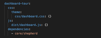
THEME.libraries.yml
Step 2: Include dashboard tour library in custom dashboard page or node template
{# In a Twig template we attach the library. #}
{{ attach_library('THEME/dashboard-tour') }}
Now, we have included the tour dependencies in our theme.
Step 3: Getting started with Shepherd.js
For a quick start, you can get an example code here https://shepherdjs.dev/
Initializing Shepherd
In dashboard.js, add the initializing code as below
const tour = new Shepherd.Tour({ defaultStepOptions: { cancelIcon: { enabled: true }, classes: 'shadow-md bg-purple-dark', scrollTo: { behavior: 'smooth', block: 'center' } }, useModalOverlay: true, });
dashboard.js
The defaultStepOptions option allows you to specify any option which should be applied to all this tour’s steps by default.
useModalOverlay is another option you can add. You can check more Tour options here.
Creating Introduction Steps
tour.addStep({ id: 'introduction', text: 'Welcome to Our Dashboard', classes: 'example-step-extra-class', buttons: [ { classes: 'btn btn-primary', text: 'Next', action: tour.next } ] });
dashboard.js
This is a welcome tour popup, so we are not assigning any element target (like a class or id). This will appear as a welcome message popup in the centre of the page.
We have more tour methods which will delve deeper in the next step.
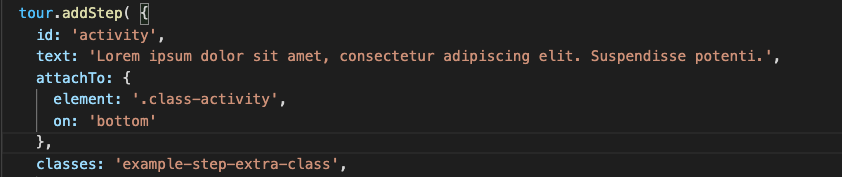
Creating the second Step – Fitness Activity
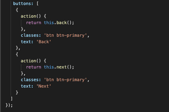
tour.addStep( { id: 'activity', text: 'Lorem ipsum dolor sit amet, consectetur adipiscing elit. Suspendisse potenti.', attachTo: { element: '.class-activity', on: 'bottom' }, classes: 'example-step-extra-class', buttons: [ { action() { return this.back(); }, classes: 'btn btn-primary', text: 'Back' }, { action() { return this.next(); }, classes: 'btn btn-primary', text: 'Next' } ] });
Tour Provides many methods. Let’s go a little further in some basic STEP OPTIONS
- id: The string to use as the id for the step. If an id is not passed one will be generated.
- text: The text in the body of the step. It can be one of three types:
◦ HTML string
◦ HTMLElement object
◦ Function to be executed when the step is built. It must return one of the two options above.
- title: The step’s title. It becomes an h3 at the top of the step.
- attachTo: The element the step should be attached to on the page. An object with properties element and on.
◦ element: An element selector string or a DOM element.
◦ on: The optional direction to place the Popper tooltip relative to the element.
- Possible string values: ‘auto’, ‘auto-start’, ‘auto-end’, ‘top’, ‘top-start’, ‘top-end’, ‘bottom’, ‘bottom-start’, ‘bottom-end’, ‘right’, ‘right-start’, ‘right-end’, ‘left’, ‘left-start’, ‘left-end’
If you don’t specify an attachTo the element will appear in the middle of the screen.
- cancelIcon Options for the cancel icon
◦ enabled Should a cancel “✕” be shown in the header of the step?
◦ label The label to add for aria-label
- classes: A string of extra classes to add to the step’s content element.
- buttons: An array of buttons to add to the step. These will be rendered in a footer below the main body text. Each button in the array is an object of the format:
◦ text: The HTML text of the button
◦ classes: Extra classes to apply to the
◦ action: A function executed when the button is clicked on. It is automatically bound to the tour the step is associated with, so things like this.next will work inside the action.
Creating the Third Step : New Courses
To keep this article short, I am not adding the further steps here. We can follow the above steps, to create as many steps required here. After creating all the steps, we will finally start the tour.
To start the tour, just call start on your Tour instance:
tour.start();
Cheers!! We have now added a tour for the dashboard.
Note: Go through and follow all available methods, events and options to get a more interactive Shepherd Tour.
Recent Blogs


Featured Success Stories

A Drupal powered multi-site, multi-lingual platform to enable a unified user experience at SEMI.
Discover how our technology enabled UX Magazine to cater to their massive audience and launch outreach programs.
Discover how a Drupal powered internal portal encouraged the sellers at Flipkart to obtain the latest insights with respect to a particular domain.