Tailwind is a utility-first CSS framework, which means that, unlike other CSS frameworks like Bootstrap or Materialize CSS, it doesn’t come with ready-made components. Instead, Tailwind CSS provides you with a set of CSS helper classes that allow you to quickly implement custom designs with ease, so you’re not stuck with using generic pre-built components.
With Tailwind, you can implement your custom designs comfortably with predefined CSS classes.
In this article, we’ll be taking a closer look at how to set up and start using Tailwind within your Svelte application. We’ll learn how to install the Tailwind library, initialize it, and use it to style our components.
To follow along, you should have a working knowledge of JavaScript and Svelte.
Installation
To create a Svelte app, first ensure you have Node.js installed on your computer. You can check by typing the following command into your terminal:
node -v
If it’s not already installed, simply go to the Node website to download the latest version.
Also, you’ll need to install the degit library so you can clone the Svelte template:
npm install -g degit
When that finishes, we can get started with our Svelte app by creating an empty folder and cloning the template into our project named tailwind:
npx degit sveltejs/template tailwind
Then, we go to our project folder on the terminal:
cd tailwind
Now that we’ve set it up, we can install our project’s dependencies:
npm install
We then run the Svelte app with the following:
npm run dev
Installing Tailwind in a Svelte app
Now that our Svelte application is ready, we have to install Tailwind using the following command:
npm install tailwindcss@npm:@tailwindcss/postcss7-compat postcss-cli@^7 autoprefixer@^9 concurrently cross-env --save-dev
For most projects (and to take advantage of Tailwind’s customization features), you’ll want to install Tailwind and its peer-dependencies via npm. concurrently allows us run multiple commands, which we will be using in our npm scripts later.
Because we’re not using the Tailwind CLI to integrate Tailwind into our project, and Tailwind CSS does not provide any vendor prefixing, Autoprefixer is recommended. Autoprefixer tracks caniuse.com to see which CSS properties need to be prefixed in order to ensure consistency across browsers.
PostCSS config
Next, we will manually create a PostCSS configuration file (postcss.config.js) in our base directory.
Add the following lines of code to your file:
const tailwindcss = require('tailwindcss');
const autoprefixer = require("autoprefixer");
module.exports = {
  plugins: [
    require("tailwindcss"),
    require("autoprefixer")
  ]
}
PostCSS is necessary to lint our CSS, hence this configuration.
Tailwind config
Like the previous step, we will now manually create a Tailwind configuration file (tailwind.config.js) in the base directory.
We can now set our own config options. Currently, the config file below uses purge to remove every unused CSS in production:
const production = !process.env.ROLLUP_WATCH;
module.exports = {
  future: {
    purgeLayersByDefault: true,
    removeDeprecatedGapUtilities: true,
  },
  plugins: [
  ],
  purge: {
    content: [
     "./src/App.svelte",
    ],
    enabled: production // disable purge in dev
  },
};
Creating CSS files
Let’s now create our actual tailwind.css and index.css files within the public folder.
In the tailwind.css file, we’ll add these directives:
@tailwind base;
@tailwind components;
@tailwind utilities;
Still within our public folder, we will navigate to our index.html and import the index.css inside our head tag:
<link rel='stylesheet' href='/index.css'>
Now, go into our package.json and use the following scripts:
"scripts": {
    "watch:tailwind": "postcss public/tailwind.css -o public/index.css -w",
    "build:tailwind": "cross-env NODE_ENV=production postcss public/tailwind.css -o public/index.css",
    "build": "npm run build:tailwind && rollup -c",
    "start": "sirv public",
    "serve": "serve public -p 80",
    "dev": "concurrently "rollup -c -w" "npm run watch:tailwind""
  },
Now run:
npm run dev
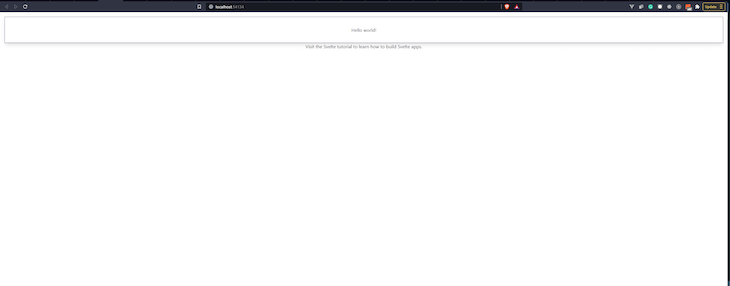
We have successfully integrated Tailwind into our Svelte project!
We can confirm this by adding the following Tailwind classes to our App.svelte file:
<main>
  <h1 class="py-8 px-4 border border-indigo-900 shadow-lg">Hello {name}!</h1>
  <p>Visit the <a href="https://svelte.dev/tutorial">Svelte tutorial</a> to learn how to build Svelte apps.</p>
</main>
You should now see this:
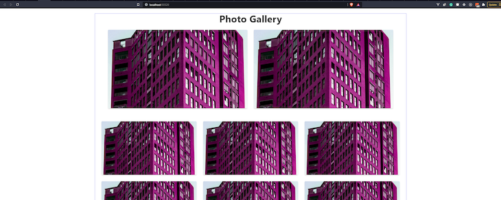
Building a photo gallery
Now, let’s use our newly-created CSS library to build a photo gallery. We’re going to clear the existing HTML in our App.svelte and follow this guide to create a gallery like the one pictured here:
First, we’ll create a surrounding div:
<div class="container mx-auto border border-indigo-500 px-4">

</div>
The container class sets the max-width of our div to the min-width of the current breakpoint. This is useful if you’d prefer to design for a fixed set of screen sizes instead of trying to accommodate a fully fluid viewport.
While mx-auto centers the div, border creates a border, and border-indigo-500 adds border color and other styling details:
<div class="container mx-auto border border-indigo-500 px-4">
  <h1 class="font-bold text-5xl">Photo Gallery</h1>
</div>
We then add our “Photo Gallery” title in an h1 tag. The font-bold helps increase the font-weight to 700 and the text-5xl sets the font-size to 3rem.
Image section
There are two section elements on the images above. The first section contains two images, while the second section contains six (three images per row):
<main>
  <div class="container mx-auto border border-indigo-500 px-4">
    <h1 class="font-bold text-5xl">Photo Gallery</h1>

    <section class="py-8 px-4">
      <div class="flex flex-wrap mx-4">
        <div class="md:w-1/2 px-4 mb-8 md:mb-0"><img class="rounded shadow-md" src="https://source.unsplash.com/random/1280x720" alt=""></div>
        <div class="md:w-1/2 px-4 mb-8 md:mb-0"><img class="rounded shadow-md" src="https://source.unsplash.com/random/1280x720" alt=""></div>
      </div>
    </section>

    <section class="pt-8 px-4">
      <div class="flex flex-wrap mx-4">
        <div class="md:w-1/3 px-4 mb-8"><img class="rounded shadow-md" src="https://source.unsplash.com/random/1280x720" alt=""></div>
        <div class="md:w-1/3 px-4 mb-8"><img class="rounded shadow-md" src="https://source.unsplash.com/random/1280x720" alt=""></div>
        <div class="md:w-1/3 px-4 mb-8"><img class="rounded shadow-md" src="https://source.unsplash.com/random/1280x720" alt=""></div>
        <div class="md:w-1/3 px-4 mb-8"><img class="rounded shadow-md" src="https://source.unsplash.com/random/1280x720" alt=""></div>
        <div class="md:w-1/3 px-4 mb-8"><img class="rounded shadow-md" src="https://source.unsplash.com/random/1280x720" alt=""></div>
        <div class="md:w-1/3 px-4 mb-8"><img class="rounded shadow-md" src="https://source.unsplash.com/random/1280x720" alt=""></div>
      </div>
    </section>

  </div>
</main>
The first section has class py-8 that adds padding to the top and bottom, and px-4 for padding to the left and right.
Then, there is an inner, surrounding div that contains Tailwind classes flex, flex-wrap, and mx-4. These classes set the display to flex, sets flex-wrap to wrap, and adds a margin to the left and right.
For the images themselves, they are individually surrounded by a div with Tailwind classes *class*="md:w-1/2 px-4 mb-8 md:mb-0". This determines the width of each image, which is 1/2 of the parent div. It also styles the padding and margin.
The images themselves now have the rounded class, which applies border radius sizes. shadow-md adds box shadows to the element.
The second section has the same styles. The only difference is that the immediate div surrounding each image has the Tailwind class md:w-1/3, which ensures the width of each image is 1/3 of the parent div, making it three images per row.
Conclusion
A big congrats to you if you’ve made it this far. You have successfully learned how to set up your Svelte project and add beautiful styles with Tailwind. The repo with all of this code is on GitHub.
If you’d like to go further, add more CSS classes to make the photo gallery more beautiful. For instance, you can add more pages, components, and even transitions. The Tailwind documentation will show the correct classes for any style you hope to create:
The post How to use Tailwind CSS with Svelte appeared first on LogRocket Blog.