There are quite a handful of reasons developers might want to check what kind of device a user is viewing a website on. For one, we have responsive design, which helps us create consistent and cohesive pages across various devices.
Another good reason is to render different content across different devices. A good example of this is the Git download page.

The page runs a script that automatically determines what operating system a user uses to view the page.
Based on that information, a relevant version presents, such as “Download for Windows” when a user is on a Windows computer or “Download on MacOS” when a user is on a Mac computer.
Our project to detect device types is very similar. The page we will build has a button that displays different text on the button depending on what the user agent’s operating system is.
This tutorial covers the following topics:
- How to create a React app and define components
- How to use the
mobile-detectlibrary - How to detect a client user device/operating system and render content accordingly
If you intend to code along, you can follow this documentation (README.md) to learn how to set up this project on your local machine.
Let’s dive in.
Understanding the user agent string
Whenever a client (web browser) makes a request to a web server for a web page, information about the request is sent over inside the HTTP header, such as the user agent.
The user agent holds a string of information that identifies the browser requesting for a page, the operating system that it runs on, and even the name of the device. All of this information is contained as part of the user agent string.
Utilizing the user agent string
In its bare form, the user agent string is not very helpful. To make sense of the user agent string and subsequently use it to deduce information about a client, we must parse it.
To do this, we deconstruct standalone information from the string, depending on what we are looking for. Thankfully, there is a very useful JavaScript library that can help us achieve this.
What is mobile-detect.js?
Mobile-detect.js is a device detection JavaScript library that helps developers determine a user’s operating system. With this information, we can then choose what kind of content to render for each detected system.
For our app, we’ll create a very simple download page named “Kingo.” The download button on this page will display the following text depending on the user’s operating system:
- “Download on Android,” if the user is viewing from an Android device
- “Download on iOS,” if the user is viewing from an Apple mobile device
- “Download on BlackBerry,” if the user is viewing from a Blackberry device
- “Download on Windows,” if the user is viewing from a Windows computer
- “Download on MacOS,” if the user is viewing from a Macintosh computer
First, let’s run the following command:
npx create-react-app kingo
This command creates a folder named kingo in the current directory and installs the dependencies for us. create-react-app automatically handles the configurations for us.
After creating our project folder, let’s start creating our components. Our React app will be comprised of just two components.
App.js, the parent componentbutton.js, the button component
But before we commence with defining our components, we must work on our template file, index.html.
Using mobile-detect.js over a CDN
There are various ways we can mobile-detect.js in our project. However, the easiest way is accessing it over a content delivery network (CDN).
To do so, navigate into kingo/public/index.html and paste the following link tag into the index.html file:
<script src="https://cdnjs.cloudflare.com/ajax/libs/mobile-detect/1.4.5/mobile-detect.min.js"></script>
With this script, we can now use mobile detect inside of our React app.
Creating our React root component
Next, let’s create our root React component, app.js. Go into kingo/src/App.js.
We must first import the React library since we are creating a React component, the app.css and button.js components (which are not defined), and the hero image:
import React from 'react';
import './App.css';
import Button from './components/Button';
import image from './5.jpg'

function App() {
  return (
    <div className="App">
      <div className="hero">
        <img src={image} alt="Kingo" />
      </div>
      <div className="text">
        <h1>Kingo App</h1>
        <p>Download the kingo app and to get up-to-date super features for free. Available for all devices.</p>
        <Button />
      </div>
    </div>
  );
}

export default App;
Our app’s view is divided into two sections. The first div, hero, holds the hero image, and the second div, text, holds the hero text as well as the button component. Later in our stylesheet, we’ll use Flexbox to align them beside each other.
Creating our button component
This is the second and final component. Go into kingo/src/components/Button.js, and inside button.js, we define a simple input element with a class and a unique id. We must also set a temporary value of Download on your device:
import React from 'react';

function Button() {
  return (
    <input type="button" id="button" value="Download on your device" />
  )
}

export default Button
Later on, we will override this value with other variations depending on what device a user is viewing our React app on.
Styling the page
To style our page, go into kingo/src/App.css and add the following:
@import url('https://fonts.googleapis.com/css2?family=Roboto&display=swap');

body {
  background-color: black;
  color: white;
  box-sizing: border-box;
  display: flex;
  align-items: center;
  justify-content: center;
  font-family: "roboto",sans-serif;
}

.App {
  display: flex;
  align-items: center;
  justify-content: center;
  margin: 70px auto;
  max-width: 1000px;
  padding: 30px;
}

h1 {
  font-size: 50px;
}

p {
  font-size: 25px;
}

img {
  height: 300px;
  width: 300px;
}

input {
  border: 2px solid brown;
  background: none;
  color: white;
  padding: 10px 20px;
  cursor: pointer;
  font-size: 19px;
  border-radius: 7px;
}

.text {
  padding: 0 40px;
}

@media(max-width: 768px) {
  .App {
    display: flex;
    flex-direction: column;
    padding: 30px;
  }

  img {
    height: 400px;
    width: 400px;
  }
}
Detecting devices with MobileDetect
The goal here is very simple: we want to display a different text on the download button based on a user’s device.
To achieve this, we must create a custom script inside of the public folder called script.js. So, go into kingo/public and create a new file named script.js.
Next, write the code for detecting the device. This code goes inside kingo/public/script.js:
function detectDevice() {
let type = new MobileDetect(window.navigator.userAgent)
let button = document.getElementById("button")


  if (type.os() === "iOS") {
    button.value = "Download for iOS";
  } else if (type.os() === "AndroidOS") {
    button.value = "Download for Android";
  } else if (type.os() === "BlackBerryOS") {
    button.value = "Download for Blackberry";
  } else if (type.os() === "WindowsOS") {
    button.value = "Download for Windows";
  } else if (type.os() === "MacOS") {
    button.value = "Download for Mac";
  } else {
    button.value = "Download on your device";
  }

}

window.addEventListener("load", detectDevice);
Let’s break down this code.
First, we initialize the MobileDetect() object and pass in the userAgent property from the windows object as a parameter.
That way, the script can access the user’s agent data of the client device viewing our page. We can also access the input element with the id value of button from the DOM and pass the input into a variable.
Next, performing a nested if statement checks the user’s operating system using the os() method. Depending on the result, we can specify different values for the button using the textContent property.
Viewing the result
The Chrome web browser comes with a built-in feature called the Chrome DevTool; all web browsers have one.
For Chrome, we simply need to toggle the DevTool either by hitting F12 on our keyboard or clicking the three dots on the top right corner, followed by selecting More Tools then Developer Tools.
To emulate a device, we must first toggle the device toolbar.
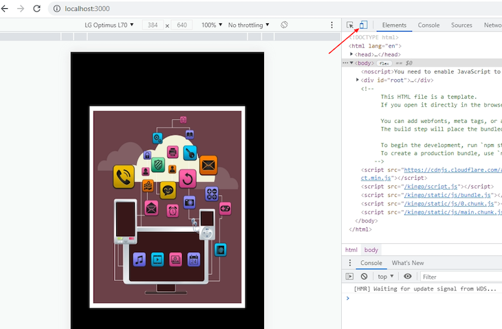
Chrome DevTool presents a list of devices that we can emulate. We can select the device from the dropdown menu on top, and, depending on which device we select, the button in our app displays a different download text.
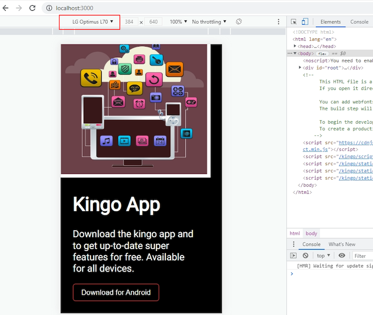
If emulating an Android device, a new page renders on reload and the button holds a different value.
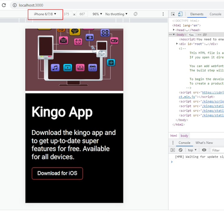
If emulating an Apple device, a different corresponding text appears.
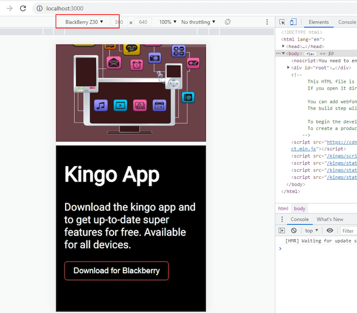
Same experience for a Blackberry device.
The same applies to Windows, MacOS, and any other specified operating systems.
Wrapping up
In this tutorial, we explored how we can detect what device a user is viewing an app page on and how to render the content accordingly. Using the os() method from the mobile-detect library, we parsed a user agent string to retrieve the information we needed.
Thank you for following along. The source code for this tutorial can be obtained from this GitHub repository.
Have a great week!
The post How to detect and render device types in React appeared first on LogRocket Blog.