Simple and straightforward to use, the React-Draggable library applies CSS transformations to React components, allowing you to drag components across a UI. With different props that let you change components’ behavior, React-Draggable is a great choice for creating intuitive, user-friendly interfaces.
In this tutorial, we’ll explore React-Draggable in depth by creating a task list with draggable components. Let’s get started!
Installing React-Draggable
Before installing React-Draggable, make sure you have a React project set up on your local machine. Navigate to the project and run the following command in the terminal:
npm install react-draggable
Now, we’ll import the <Draggable/> component from the library. To add movement to an element or a component, we can simply wrap the <Draggable/> component around it.
Add the following code to App.js:
import Draggable from "react-draggable";

function App() {
  return (
 <Draggable>
      <div>I can now be moved around!</div>
    </Draggable>
  );
}

export default App;
The code above will render the following output in the browser:

Now that you know how the React-Draggable library works, let’s get started on our task list.
Setting up a React app
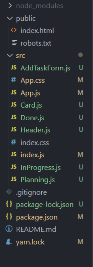
With the React-Draggable library installed, we can set up the required file structure for our project and review the components that we’ll need. To assign unique keys to key components, we’ll need to install a UUID() as follows:
npm i uuid
Our folder structure will look like the image below:
Creating the task list
We’ve broken down the logic for our project into three different components. Our task list will use three columns to render their respective tasks.
We’ll add a form element to take input from the user and add the task in the respective component. Our App.js file handles the main task list in its state:
import "./App.css";
import { useState } from "react";

function App() {
const [tasks, setTasks] = useState([]);
  const [addItem, setAddItem] = useState(false);
  const handleSubmit = () => {
    setAddItem(!addItem);
  };
  const addTask = (task) => {
    setTasks(task);
  };
  return (
  <div>
 </div>

  );
}


export default App;
In the code above, we’ve added the following functions:
tasks: holds the array of tasks that will be rendered on the screenaddItem: the state for showing and hiding theAddFormelement, which adds a task
Now that we have the states ready, let’s create the other components.
Header component
Add the following code to Header.js:
import React from "react";

export default function Header({ handleSubmit }) {
  return (
    <div className='header'>
      <button onClick={handleSubmit} className='addButton'>
        Add Task
      </button>
      <p>Planning</p>
      <p>In Progress</p>
      <p>Done</p>
    </div>
  );
}
The </button> gets the handleSubmit function as a prop, which will show the AddForm element. With our header set up, let’s create the AddForm element:
AddForm element
Add the following code to AddTaskForm.js:
import React, { useState } from "react";
import { v4 as uuidv4 } from "uuid";

export default function AddTaskForm({ setAddItem, addItem, tasks, setTasks }) {
  const [name, setName] = useState("");
  const [description, setDescription] = useState("");
  const [option, setOption] = useState("");

  const handleSubmit = (e) => {
    e.preventDefault();
    let newTask = {
      id: uuidv4(),
      name: name,
      description: description,
      timeline: option,
    };
    setTasks([...tasks, newTask]);
    setAddItem(!addItem);
  };
  return (
    <div className='addForm'>
      <form onSubmit={(e) => handleSubmit(e)}>
        <input
          type='text'
          placeholder='Name'
          onChange={(e) => setName(e.target.value)}
        />
        <input
          type='text'
          placeholder='Description'
          onChange={(e) => setDescription(e.target.value)}
        />
        <select
          name='timeline'
          id='timeline'
          onChange={(e) => {
            setOption(e.target.value);
          }}
        >
          <option value=''></option>
          <option value='planning'>Planning</option>
          <option value='inprogress'>In-Progress</option>
          <option value='done'>Done</option>
        </select>
        <button type='submit'>Add</button>
      </form>
    </div>
  );
}
In the code block above, we have input fields that will take relevant data provided by users. Each task has an id, name, date, and timeline , which are taken by the select element.
When the form is submitted, each task will be added to the task list that we created in App.js. When the form is submitted successfully, it will be hidden.
Creating the columns
In our task list, we’ll have three columns titled Planning, In Progress, and Done. Let’s create these components and add their respective code:
Planning.js
import React from "react";
import Card from "./Card";

export default function Planning({ tasks, addTask }) {
  return (
    <>
      {tasks
        .filter((item) => item.timeline === "planning")
        .map((e) => (
          <Card currentTask={e} tasks={tasks} addTask={addTask} />
        ))}
    </>
  );
}
InProgress.js
import React from "react";
import Card from "./Card";

export default function InProgress({ tasks, addTask }) {
  return (
    <>
      {tasks
        .filter((item) => item.timeline === "inprogress")
        .map((e) => (
          <Card currentTask={e} tasks={tasks} addTask={addTask} />
        ))}
    </>
  );
}
Done.js
import React from "react";
import Card from "./Card";

export default function Done({ tasks, addTask }) {
  return (
    <>
      {tasks
        .filter((item) => item.timeline === "done")
        .map((e) => (
          <Card currentTask={e} tasks={tasks} addTask={addTask} />
        ))}
    </>
  );
}
You may have noticed that all of these components hold a similar logic. We are getting the tasks and filtering them based on their timeline using tasks.filter(), which removes the task objects that do not belong in the column.
For example, in the planning component, filter() will remove every object that does not have the planning string in its timeline attribute.
The array returns a result and renders a <Card/> component. Let’s create Card.js in the same directory and add the code snippet below:
import React from "react";
import Draggable from "react-draggable";

export default function Card({ currentTask, tasks, addTask }) {
  return (
    <Draggable grid={[10, 10]} axis='y' bounds='parent'>
      <div className='card' key={currentTask.id}>
        <div className='heading'>
          <h3>{currentTask.name && currentTask.name}</h3>
          <img
            onClick={() => {
              const newTaskList = tasks.filter((item) => {
                if (item.id != currentTask.id) {
                  return item;
                }
              });
              addTask(newTaskList);
            }}
            src='https://toppng.com/uploads/preview/recycling-bin-vector-delete-icon-png-black-11563002079w1isxqyyiv.png'
            style={{ height: "20px", width: "20px" }}
          />
        </div>
        <p>{currentTask.description}</p>
      </div>
    </Draggable>
  );
}
The <Card/> component gets three props, which are required for rendering and deleting logic.
The parent div <Draggable> is imported from our library, making the whole card moveable. By default, you can move the card anywhere on the screen. However, to prevent it from going outside of its parent element, we’ll provide a value to a bounds prop.
Deleting the task
For removing a task, add the code below:
  const newTaskList = tasks.filter((item) => {
    if (item.id != currentTask.id) {
      return item;
    }
  });

  addTask(newTaskList);
The code block above gets the entire list of tasks from App.js, then creates a new list that excludes the current task. Next, let’s import each component in App.js:
import "./App.css";
import { useState } from "react";
import Header from "./Header";
import Planning from "./Planning";
import InProgress from "./InProgress";
import Done from "./Done";
import AddTaskForm from "./AddTaskForm";
function App() {
  const [tasks, setTasks] = useState([]);
  const [addItem, setAddItem] = useState(false);
  const handleSubmit = () => {
    setAddItem(!addItem);
  };
  const addTask = (task) => {
    setTasks(task);
  };
  return (
    <div>
      <Header handleSubmit={handleSubmit} />
      <div className='mainGrid'>
        <div className='column'>
          <Planning tasks={tasks} addTask={addTask} />
        </div>
        <div className='column'>
          <InProgress tasks={tasks} addTask={addTask} />
        </div>
        <div className='column'>
          <Done tasks={tasks} addTask={addTask} />
        </div>
        {addItem && (
          <AddTaskForm
            addItem={addItem}
            setAddItem={setAddItem}
            tasks={tasks}
            setTasks={addTask}
          />
        )}
      </div>
    </div>
  );
}

export default App;
Finally, we’ll add styles to our task list. Add the following code in App.css:
.mainGrid{
  display: flex;
  flex-direction: row;
  justify-content: space-between;
  flex-wrap: wrap;
  height: 100vh;
}
.header{
  display: flex;
  flex-direction: row;
  justify-content: space-around;
  flex-wrap: wrap;
  background-color: rgb(205, 240, 240)
}
.column{
  width: 32vw;
  display: flex;
  flex-direction: column;
  border: 5px solid grey;
  background-color: azure;
  overflow: hidden;
}
.card{
  border: 1px solid black;
  background-color: white;
}
.card p{
  font-size: 10px;
  width: 30vw;
}
.heading{
  display: flex;
  flex-direction:row;
  align-items: center;
  justify-content: space-between;

}
.addButton{
  position:absolute;
  top: 2.5%;
  left: 0%;
}
.addForm{
  height: 50vh;
  width: 50vw;
  background-color: lightblue;
  display: flex;
  align-items: center;
  justify-content: center;
  flex-direction: column;
  position: absolute;
  top: 25%;
  left: 25%;
}
.addForm form{
  display: flex;
  align-items: center;
  justify-content: center;
  flex-direction: column;
}
When we run the project and add an item to our task list, the output will look like the image below:
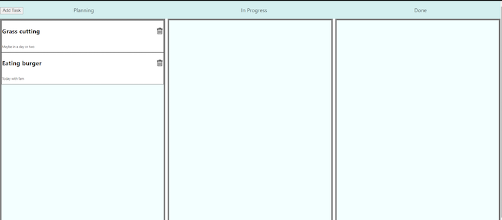
These tasks are moveable within their respective columns:
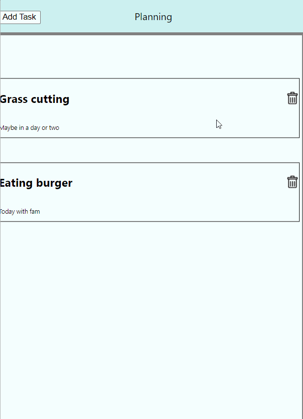
To delete a task, simply click on the delete icon.
Conclusion
Adding movement to components in your application has benefits for your UI like improved visual interest and better organization. The React-Draggable library is a great choice for its simplicity and functionality.
In this tutorial, we used React-Draggable to create a task list. To learn more about React-Draggable, be sure to visit the GitHub page.
The post Create draggable components with React-Draggable appeared first on LogRocket Blog.