A tooltip is a feature that offers a hint, descriptive message, or piece of information about an element. When a user hovers, focuses, or clicks on the element, the tooltip appears as a small label near the element. Tooltips are especially helpful for providing clarifications, definitions, or next steps for users without cluttering your UI.
In this article, we’ll review the options that are currently available for creating tooltips in Vue applications. Then, we’ll create our own Vue tooltip component from scratch using the information provided. For our example, we’ll use the Vuetify and the BootstrapVue libraries.
Getting started
First, make sure you have Vue CLI 4.X installed on your machine. To create a new Vue project, run the following command in your terminal:
vue create tooltips
Let’s delete the default components in our new project and make sure that nothing renders in the browser. Our App.vue file should look like the code block below:
<template>

</template>

<script>

export default {
  name: 'App',

  components: {
  },

  data: () => ({
    //
  }),
};
</script>
Create a tooltip in Vuetify
To install Vuetify, run the following command in the terminal:
vue add vuetify
Now, the Vue CLI will install Vuetify for us. To create a tooltip, add the following code to app.vue and serve the project again:
<template>
<div>


<v-app>
  <div class="text-center d-flex align-center justify-space-around">
    <v-tooltip bottom>
      <template v-slot:activator="{ on, attrs }">
        <v-btn
          color="primary"
          dark
          v-bind="attrs"
          v-on="on"
        >
          Hover on me
        </v-btn>
      </template>
      <span>Bottom tooltip</span>
    </v-tooltip>


  </div>
</v-app>

</div>
</template>

<script>

export default {
  name: 'App',

  components: {
  },

  data: () => ({
    //
  }),
};
</script>
<style>
.container{
margin-top:50px
}
</style>
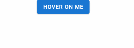
Each component from Vuetify must be rendered inside of the <v-app> component, and <v-tooltip> can wrap around any component.
In the code above, we have two main elements, <template>, which is rendered as a simple text, and <span>. When we hover on the button, the v-slot attribute activates the tooltip, and the <span> content is displayed on the screen:
You can also trigger the tooltip’s behavior dynamically with the following code:
<template>
<div>
<v-app>
  <div class="text-center d-flex align-center justify-space-around">
<v-btn @click="show = !show">
          toggle
        </v-btn>
</div>
  <div class="text-center d-flex align-center justify-space-around">
    <v-tooltip v-model="show"
 bottom>
      <template v-slot:activator="{ on, attrs }">
        <v-btn
          color="primary"
          dark
          v-bind="attrs"
          v-on="on"
        >
          Hover on me
        </v-btn>
      </template>
      <span >Bottom tooltip</span>
    </v-tooltip>
  </div>
</v-app>

</div>
</template>

<script>

export default {
  name: 'App',
  components: {
  },
   data () {
      return {
        show: false,
      }
    },
};
</script>
<style>
.container{
  margin-top:50px
}
</style>
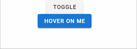
In the code block above, we created a new button and added a state inside of the component.
Initially, the tooltip is set to false. v-modal lets us choose whether to display the tooltip or not. The state changes with the button click, as seen in the image below:
Create a tooltip in BootstrapVue
To install BootstrapVue, run the following command in the terminal:
npm install vue bootstrap bootstrap-vue
Now, we must register BootstrapVue in our application’s main entry point. Navigate to main.js and add the code below:
import Vue from "vue";
import App from "./App.vue";
import { BootstrapVue, IconsPlugin } from "bootstrap-vue";
import "bootstrap/dist/css/bootstrap.css";
import "bootstrap-vue/dist/bootstrap-vue.css";

import vuetify from "./plugins/vuetify";

Vue.config.productionTip = false;
Vue.use(BootstrapVue);
Vue.use(IconsPlugin);
new Vue({
  vuetify,
  render: (h) => h(App),
}).$mount("#app");
We have two different methods to create tooltips in BootstrapVue, the component approach and the directives approach. While the component approach is well-suited for simple, standard use, the directives approach offers more potential to customize the tooltip’s behavior.
Keep in mind that we can trigger a tooltip by either hovering, focusing, or clicking on an element.
We also have 12 choices for positioning our tooltip, with top being the default: top, topleft, topright, right, righttop, rightbottom, bottom, bottomleft, bottomright, left, lefttop, and leftbottom.
The component approach
In BootstrapVue, tooltips come as components that attach to the target element through the component’s ID. To create a tooltip using the component approach, we can simply create a button and put the ID in the target attribute.
Add the following code to App.vue:
<template>
  <div class='main'>
  <b-button id="tooltip-target-1">
    Hover Me
  </b-button>
  <b-tooltip target="tooltip-target-1" triggers="hover"   placement="bottom"
>
    I am tooltip <b>component</b> content!
  </b-tooltip>
  </div>
</template>

<script>
export default {
  name: "App",

  components: {},
};
</script>
<style>
.main{
display:flex;
justify-content:space-around;
}
</style>
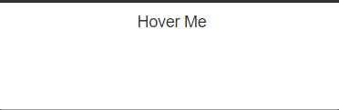
In the code above, we created a button called b-button and gave it a specific ID, tooltip-target-1. To trigger a tooltip on hover, we can simply use the b-tooltip component and put our button’s ID in the target attribute.
The trigger attribute is responsible for the tooltip’s behavior. By default, we have triggers for hover, focus, click, and hover+focus. We can define the tooltip’s position using placement:
The directives approach
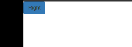
The directives approach allows us to use custom directives to specify the behavior of our tooltip component. To create a tooltip using the directives approach, simply use the v-b-tooltip inside of the component.
For example, we can add the code block below to App.vue:
<template>
  <div>
         <b-button v-b-tooltip.hover.right="'Tooltip!'" variant="primary">Right</b-button>

  </div>
</template>

<script>
export default {
  name: "App",

  components: {},


};
</script>
<style></style>
Serve the project and navigate to the browser. Your tooltip should look like the image below:
We can change the behavior of tooltip on mouse actions using directives. Let’s add more buttons in App.vue:
<template>
  <div class='main'>
    <b-button v-b-tooltip.hover.right="'Tooltip!'" variant="primary"
      >hover</b-button
    >
    <b-button v-b-tooltip.focus.right="'Tooltip!'" variant="primary"
      >focus</b-button
    >
    <b-button v-b-tooltip.click.left="'Tooltip!'" variant="primary"
      >click</b-button
    >
  </div>
</template>

<script>
export default {
  name: "App",

  components: {},
};
</script>
<style>
.main{
display:flex;
justify-content:space-around;
}
</style>

Create a tooltip from scratch
With the methods we’ve reviewed so far, we have to install external packages to create a tooltip, resulting in increased dependency sizes. Changes in our dependencies may cause our app to break. However, if you’re using a single tooltip, you can create one from scratch in just a few minutes instead of installing a library.
In your component folder, create a new file called Tooltip.vue and add the following code:
<template>
  <div class="tooltip-container">
    <slot />
    <div
      class="tooltip"
    >
      <span
        class="text"
      >{{ text }}</span>
    </div>
  </div>
</template>
In the code block above, we’ve created the main tooltip container, which will house the whole component. The slot tag injects the child component that will enable the tooltip. Finally, a simple <span> holds the text for our tooltip:
<script>
export default {
  props: {
    text: {
      type: String,
      required: true
    }
  },
}
</script>
Finally, we’ll add a prop for our text in the form of a string:
<style scoped>
.tooltip-container {
  position: relative;
  display: inline-block;
  margin:100px;
}

.tooltip-container:hover .tooltip{
  opacity: 1;

}

.tooltip {
  color: #ffffff;
  text-align: center;
  padding: 5px 0;
  border-radius: 2px;

  width: 120px;
  bottom: 100%;
  left: 50%;
  margin-left: -60px;

  opacity: 0;
  transition: opacity 1s;

  position: absolute;
  z-index: 1;

  background: #000000;
}

.text::after {
  content: " ";
  position: absolute;
  top: 100%;
  left: 50%;
  margin-left: -5px;
  border-width: 5px;
  border-style: solid;
  border-color: #000000 transparent transparent transparent;

}
</style>
The position of the main container is relative. For the tooltip, we have the z-index set to 1, displaying the tooltip above the element.
Next, we rendered a small, simple arrow tip. By default, opacity is set to 0. When a user hovers over a component inside of our tooltip component, the opacity is set to 1, displaying our tooltip above the element.
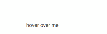
To use our custom tooltip, import and register the tooltip in App.vue:
<template>
<div >
<Tooltip
text="I am button"
>
<button> hover over me </button>
</Tooltip>
</div>
</template>
<script>
import Tooltip from './components/Tooltip';
export default {
name: "App",
components: {
Tooltip
},
};
</script>
Let’s serve our project and see the outcome in the browser:
Conclusion
Tooltips are a helpful and intuitive addition to your application that improve your UX by guiding users and answering questions in advance. Now, you know a few different ways to create a tooltip in Vue, from using libraries like BootstrapVue and Vuetify to starting from scratch.
Using a library to create a tooltip is fairly easy, however, if you are concerned about the size of your dependency tree, creating your own tooltip is just as straightforward.
Although our examples featured a simple tooltip component, you can customize yours with different colors, icons, movements, and more. I hope you enjoyed this tutorial!
The post Create a custom tooltip component in Vue appeared first on LogRocket Blog.